
Top Ten Tuesday is a weekly feature hosted by The Broke and the Bookish. Each week there is a new topic for bloggers to choose and list their top ten. This week’s theme is a cover theme freebie, so I picked Top Five Cover Changes I Loved and Top Five Cover Changes I Didn’t Like.
Everyone has an opinion on cover changes, and no matter whether you love the new design or prefer the old one everyone (likely) agrees that there is nothing more annoying than when a series changes covers halfway through. For this week’s free cover themed pick I thought it was the perfect time to talk about some of the best and worst (in my opinion) cover changes, all halfway through a series.
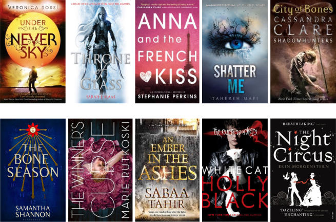
Top Five Cover Changes I Loved

Under the Never Sky by Veronica Rossi
If I’d have discovered this book when it still had the original cover I highly doubt I would have picked it up. To say I’m not a fan seems too little; the models look fake, a little like Barbie dolls, and it freaks me out. Plus I love the bright colours they used for the new cover design.

Throne of Glass by Sarah J. Maas
I’m not sure what look they were going for with the original cover, but the model doesn’t look vicious enough to be considered Adarlan’s greatest assassin. The new cover design definitely shows a more badass version of Celaena, and it fits the story much better as well.

Anna and the French Kiss by Stephanie Perkins
The original cover could literally belong to any YA contemporary book, in fact if I’d have seen that cover first I likely would have kept this book on my to-read list for much longer. The new design gives me more of a sense of wanderlust, being set in Paris, and stands out from all the others.

Shatter Me by Tahereh Mafi
Normally I don’t mind models on covers, if they fit with the story being told. Looking at the original cover I don’t feel it fits Shatter Me and when I look at the model I don’t see Juliette either. I like the optical illusion in the new design, of the trees as eyelashes and the waterfall as tears.
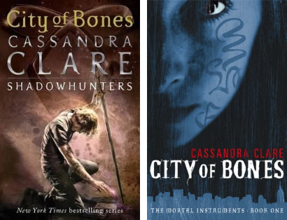
City of Bones by Cassandra Clare
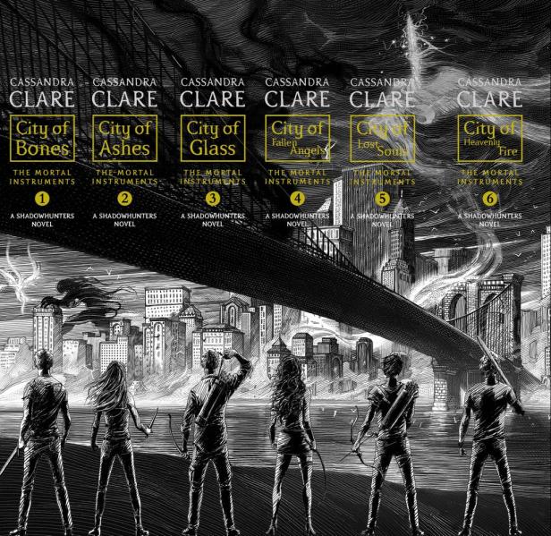
When it comes to the new design there’s not really anything I don’t like. The Mortal Instruments series has had so many cover designs and re-designs, and what makes these ones stand out so much for me is the image on the spines which is only complete when you own the whole collection.
Top Five Cover Changes I Didn’t Like

The Bone Season by Samantha Shannon
This may just be me being petty because I owned the first two books in the original covers before they changed the design halfway through the series, but putting that to the side for the moment I still prefer the original design to the new one. It just suits the series more in my opinion.

The Winner’s Curse by Marie Rutkoski
Normally I’d prefer the new cover design, because it conveys a sense of action more than the original, but that’s not who Kestrel is. She’s not a fighter in the first book, she’s a girl who wears fancy dresses, attends fancy parties, and battles with her words rather than weapons.
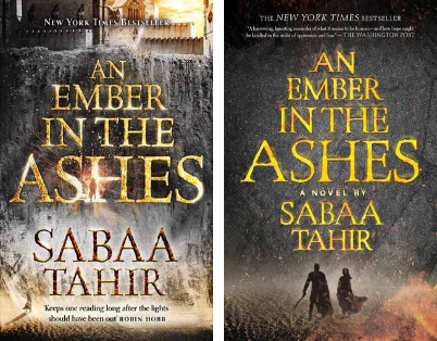
An Ember in the Ashes by Sabaa Tahir
Potentially this is a case of me being petty again because I have the first book in the original cover and the second in the new one, but I love the subtle details in the original design you have to actively search for, like the figure in the H of ‘Ashes’. In comparison the new cover looks dull and dreary.

White Cat by Holly Black
I read this book ages ago, but from what I remember the original cover design fit the story so much better. The new cover could be a generic one from any fantasy book, and it doesn’t really do anything to convey the dark gritty feel of White Cat.

The Night Circus by Erin Morgenstern
The original cover is the one I own and so automatically going to be my favourite, but the new design just feels cramped. There is so much going on, and while it conveys the busy feel of the circus accurately I’m not a fan of the new silhouettes they’ve designed for Marco and Celia.
So what do you think? Did you take part in this week’s Top Ten Tuesday, if so let me know what you picked for this week’s themed free-for-all, or what covers changes you loved and hated.

I definitely agree with your don’t likes! Why did they have to do that to them?
My TTT.
LikeLiked by 1 person
Who knows? I’m still not 100% sure why they end up changing book covers but the questions become even more pressing when it’s a bad cover change! 🙂
Thanks for the link, I’ll definitely check out your TTT! 😀
LikeLiked by 1 person
Ohhh I agree with SO many of these, I don’t know where to start!! Firstly, it’s such a great feeling when a cover change goes right haha. I prefer the new design of the Throne of Glass book so much more than the previous one. And the new Shatter Me book cover is SO stunning! Also gosh, I’ve never seen that City of Bones cover (the one on the right)! Oh boy the new one is 10 times better. I adore how the new spines of the series create an image oh my gosh!! I’m in love with books that do that.
Ughhh it can be so annoying when a series changes a cover and it’s worse than the original, and especially if it’s in the middle of a series. *shudders* The new Winner’s Curse series covers doesn’t reflect Kestrel at allllll the change was so unnecessary! Oh I prefer the original Night Circus cover as well. I love that it’s not too clustered and has such a minimalist feel to it ahah. Loved your picks this week Beth!
LikeLiked by 1 person
Oh that’s great to hear! 😀 There are plenty of examples where cover changes have gone right, and yeah it’s definitely a good feeling. Throne of Glass and Shatter Me are two perfect examples of that. I would not have picked those books up when I did if they’d still kept the original covers! 🙂
The old one was the UK edition, I had it for the first two books but yeah the new covers are so so much better. The spine images just make it all the better.
Covers changes in the middle of a series is always going to be one of my pet peeves. Doesn’t matter if it’s amazing it still really annoys me because I end up with a collection that doesn’t match.Luckily I have the original covers for The Winner’s Trilogy and The Night Circus!
Thanks so much Analee! 😀 ❤
LikeLiked by 1 person
Oh yes definitely. Cover changes in the middle of a series are going to be annoying no matter what for sure! It’s so inconsiderate, really, having the readers buy books with a certain cover and then changing the covers midway. At least finish the collection with the same kind of covers before releasing a new design for the books! 😩 At least then we can have a complete, matching set ahah. (And don’t get me started on sizes or formats changed in the middle of a series…)
LikeLiked by 1 person
Yes exactly, and if they have to change the covers then fine but at least release the old ones alongside so people can complete their series with the same designs I 100% agree. 🙂
Oh man size and format changes are just as annoying! I like my series to look the same, makes my bookshelves look so much prettier! 😀
LikeLiked by 1 person
Hahah got to agree with most of your likes and dislikes here. I personally don’t enjoy real people on book covers. I just find them really unappealing hahah Some of these cover changes are soooo drastic though and some of them are really baaaad.. I don’t know what went through their minds when they first wanted to sell these books hahah
LikeLiked by 1 person
Ha, that’s good to hear. I think when it comes to real-life models on book covers it can be hard to get it right sometimes. Well a lot of the ones I featured were changed after the first book was released, so it was almost like they realised they weren’t going to sell well if they kept the original covers. Better late than never I guess! 😀
LikeLiked by 1 person
Even though I haven’t read some of these, I agree with most of your choices! I’m so glad they changed the original ToG cover, as it just didn’t seem to fit Celaena at all. And even though I’m not a huge fan of the Shatter Me series, I’ve always loved the abstract covers. They’re probably some of the most striking covers I’ve seen in YA. And ten thousand times yes to the new Mortal Instruments covers. I never really liked the original US covers but the new ones are so much more fitting and fairly artistic. I need to buy the collection so I can have the spines placed together 😀 They’d look so cool on bookshelves!! I definitely agree with White Cat and An Ember in the Ashes. The original covers were so much more complementary to the story than the redesigns. Even though I haven’t continued on with the White Cat series, the first book is one of my favorites simply for its cover. I like having it on my shelf haha. And I’ll always be a fan of the original Night Circus cover, mostly because that’s how I bought it. Plus, I have to agree. The new cover DOES look really cramped. Too much going on. Sometimes, simplicity goes a long way lol. Great picks, Beth! 😀
LikeLiked by 1 person
Ha, that’s great to hear Azia. The second cover for the ToG series is definitely better suited to the story and Celaena’s character. Can you imagine what the rest of the series would have been like if they’d kept the original covers and not changed them? They’re gorgeous covers, luckily I enjoyed the stories as well so with the Shatter Me series it was the best of both worlds.
The cover I featured as the original TMI one was the UK cover, wasn’t a fan but the story was good so I looked past it, but I prefer the new covers 100 times more than the old ones, the spines are just amazing.
Those are two cases I wish they’d stuck to the original covers, I guess there must be more people who prefer the new ones though because they obviously change covers for a reason. I guess maybe as the markets change or something I dunno.
I think that’s the same reason I prefer the original TNC cover, but I can still see the appeal of the new cover, it’s just too cramped for my tastes.
Thanks so much Azia! 😀
LikeLiked by 1 person
Oh god that would have been terrible. Just terrible. The feel of the entire series probably would have been wrong the entire time haha. I’m glad you managed to fall for the Shatter Me series. I’m a little sad that I couldn’t get into it 😦
Yeah, I actually don’t know why some covers are updated. A good number of them don’t really need them if you ask me. Although, there ARE some that are in desperate need of a facelift LOL
And no worries! ❤
LikeLiked by 1 person
It definitely would not have fit, especially as Celaena’s character changed and developed throughout. The original covers would not have fit her or her story at all!
Yeah it’s a shame, but if it wasn’t for you then I’m sure there are other books out there you will love more. 🙂
It seems like it’s always the good covers that get changed and never the ones that need it. I wonder why that is! 😀
LikeLiked by 1 person
I know right? Just leave the good ones alone please lol 😆
LikeLiked by 1 person
Unfortunately that may never happen.
LikeLiked by 1 person
I agree with so many of these, Beth! I definitely have a love/hate relationship with cover changes when it comes to books because some they change for the better and then some just no. And I 100% agree with everyone you picked for cover changes you’ve loved. I was so happy when they changed the Shatter Me covers because I didn’t care for the original at all. And even though I have different covers for Under the Never Sky (mine are purple, green, and blue – the US ones I assume) I really prefer that to the original as well. I remember when I first saw the cover for that one before the cover change and almost didn’t pick it up because of that. I’m completely with you on The Bone Season, the original covers fit the series so much more. Although, I know we’re both buying the new covers along with special editions in the old cover style. 😂 And I’m glad I bought The Winner’s trilogy before the cover change. I have them in the original covers. They definitely fit Kestrel more because she was never a big fighter. I loved that about her though. She proves that you don’t have to be strong to be strong. Anyway! Great picks for this week. 😁♥
LikeLiked by 1 person
We must have very similar tastes in covers in that case! 😀 Yeah there are times when I don’t mind cover changes, normally the only time they bug me is when they change in the middle of a series, like with TBS. I do think if they’d kept the original Shatter Me covers I wouldn’t have picked up that series for a longer time, the old cover just wouldn’t have interested me in the story you know?
The US ones for Under the Never Sky are really nice as well, then again anything is better than the original UK cover. What was the original US one, the same as the UK?
Ha, yes I’m glad they’re doing that for TBS, however yeah I’m still buying the new covers in paperback as they’re released, can’t quite resist having both covers on my shelves.
I haven’t actually seen the new covers for The Winner’s trilogy on the shelves actually, every time I’m in Waterstones it’s still the old covers. But yeah they definitely suit Kestrel’s character more, it’s why I liked them when normally I can be kind of so-so about girl in gown covers.
Thanks so much Melissa! 😀 ❤
LikeLiked by 1 person
Same! I really don’t care for covers changes in the middle of a series. So far, I’ve only had that happen with TBS though. I’ve yet to have another series change covers in the middle. Usually just cover changes after all the books are out or when there’s only one book.
I probably wouldn’t have picked up the Shatter Me books for a while if they had kept the original covers either. They new covers are what actually drew me to the series because they’re so gorgeous and they definitely fit the story better.
I’m not sure if the original cover for the US for Under the Never Sky was the same as the UK. I do know that whenever I came across it on GR the first time it had the original UK cover as the picture for it still though. Me either about the new TBS covers. I blame how much I love the series, it makes me want every edition. 😂
I haven’t seen them on the shelves either. I’ve only seen pictures online. I wonder if that’s because the copies with the old covers sell better?
You’re welcome, Beth!! 😊♥
LikeLiked by 1 person
There have been a few for me. In fact one series I used to buy had so many books I ended up with three sets of different covers, simply because they were changed in the middle of the series twice!
Yeah that’s when I see the most cover changes happening as well, that’s not too bad I think. 🙂
It’s what drew me as well. I can remember seeing the original cover for Shatter Me and it just didn;t interest me at all. The new covers are 100 times better.
I feel like a lot of the time once new covers are release, especially if it’s after just one book has been released, most people forget the original ones.
Yeah I’ll blame it on that as well! 😀
Who knows, but I wouldn’t doubt that was the case. 🙂 ❤
LikeLiked by 1 person
Of the one I’ve actually read 3ad or own… I love the pink Anna and the French Kiss cover best. And the original Night Circus cover. 😀 This was a great idea for this topic!
LikeLiked by 1 person
Yeah the pink Anna and the French Kiss cover is my favourite as well, it makes the story seem so much more unique compared to every other YA contemporary book out there.
Nothing can beat the original Night Circus cover either.
Thanks so much Chrystal. 😀
LikeLike
I totally agree on the Throne of Glass one, don’t know what they were going for with the first cover, so glad they changed it!
My TTT: https://jjbookblog.wordpress.com/2017/05/02/top-ten-tuesday-105/
LikeLiked by 1 person
I think a lot of people feel the same way. Guess in the end it’s good they changed it! Thanks for the link, I’ll definitely check out your TTT! 🙂
LikeLike
Yes, it is!
LikeLiked by 1 person
Oh I love this and agree with so many of these. The Shatter me cover is one of the most stunning in my bookshelf for sure, I love this eye, it stands out so, so much and it’s just overall beautiful. I reaaally prefer the first one for The Winner’s Curse series, it’s so much more beautiful. Sometimes I wonder just WHY they do all of these bad changes ahah 🙂 Lovely choices Beth!
LikeLiked by 1 person
Thanks so much Marie, and oh that’s great to hear! Yeah the newer design for the Shatter Me trilogy is a lot more unique, the original cover could have belonged to any book couldn’t it? I wish they would just keep covers the same and not change them, especially halfway through a series you know?
Thanks Marie! 😀 ❤
LikeLiked by 1 person
I like your choices, Beth! I definitely agree re: Throne of Glass and Shatter Me, even if I didn’t love the former and haven’t read the latter, haha. The cover changes did those series a favour, I think.
As for The Bone Season – as far as I can tell, aren’t they still publishing in both covers? I was under the impression that one is the UK version and the other is the US version. I can’t be sure, though.
Those City of Bones spines are SO GORGEOUS. Pity I’ll never finish the series, but damn, I’d love to have them on my shelves. 😂
LikeLiked by 1 person
Thanks so much Reg. Well you don’t have to like a book to like the cover do you? There are books I liked but hated the cover and then vise versa. Either way the second cover design for Throne of Glass and Shatter Me are so much better for the series.
They published the original covers as a special edition for the third book, not sure whether they’re going to do that for the rest of the series, but no they’re new cover designs. It’s what they’ll selling in the UK now too.
They really are, definitely influenced my decision to buy those covers, luckily I’m enjoying the series as well! 😀
LikeLike
Generally I dislike cover changes because it means my books don’t match! But sometimes they are for the better. 🙂 My TTT
LikeLiked by 1 person
That’s pretty much always my stance on them, even when they are for the better I like having matching series! 🙂
Thanks for the link, I’ll definitely check out your TTT. 🙂
LikeLike
I only read the first Throne of Glass book, but I actually thought the original cover fit the story far better than the redesign…but then I also didn’t convince the protagonist was a convincing badass assassin in the first novel either. The frilly look was more honest. Maybe she gets more badass as the series continues.
LikeLiked by 1 person
Ohh that’s an interesting take on it, and one I didn’t think of myself. 🙂 I definitely agree Celaena wasn’t a badass assassin in the first book but from the second onwards she did become one, and the redesigns definitely fit those stories, and Celaena’s character, much better. 🙂
LikeLike
I am almost shocked by how my h I agree with every single one of these! Especially The Winners Curse and The Night Circus, glad I got the original covers on those! I also think the BEST cover redesigns are Throne of Glass and Shatter Me, I mean…yikes.
I love how you mentioned Kestrel on the Winners Curse covers, nailed it! Before I read the book I hated the cover and would definitely go for a more “fighty” cover but like you said that’s not who Kestrel is and therefore the original covers are more fitting.
Great list as always Beth! 😁
LikeLiked by 1 person
I’m glad you do agree with these, means I’m not alone in my cover preferences! 🙂 Yeah I’m glad I got the original Winner’s Curse and The Night Circus covers, those are definitely the better ones in my opinion, and I’m glad I got the later design of the ToG series too.
I wouldn’t really say I’m a massive fan of girl in a gown covers because a lot of the time it doesn’t fit the story, but in Kestrel’s case it really does. It’s actually the redesign that doesn’t fit the story this time around.
Thanks so much Heather! 😀
LikeLiked by 1 person
Great topic to blog about! I agree about Winner’s Curse. The Throne of Glass change was a vast improvement! – Shelly
LikeLiked by 1 person
Thanks so much Shelly. Yeah I think of all the covers I featured this week most people also prefer the ToG and Shatter Me redesigns! 🙂
LikeLike
Great picks! I love the new covers of the Holly Black trilogy, they are so simple and pretty, I’m sorry you don’t like them. Ugh I don’t like the new Night Circus covers. That’s the only one they sell here & I refused to buy it. Like the circle is cut out and I hate it.
LikeLiked by 1 person
Thanks so much Meghan. Oh I do like the new covers, I just think the old ones fit the overall theme of the story better. The newer ones could actually belong to any story but the old ones could only fit the Curse Workers series you know?
No I’m not a fan. I’m glad I got a copy of the old cover before they redesigned it!
LikeLiked by 1 person
I understand what you mean, it’s true, I just like that they’re simple.
Lucky you! I may just borrow it from the library since I don’t like the cover! Ha!
LikeLiked by 1 person
Definitely a good plan if you’re not a fan of the cover! 😀
LikeLiked by 1 person
I’ll just be here LAUGHING at the Under the Never Sky cover they really do look like creepy barbie dolls XD
The New Perkins covers are so much better, also the model on the original cover looks like she’s in her 30s and doesn’t go with the story at all.
I have the matching spine box set of TMI too it was just too pretty not to grab, plus I have TID with those spine so they couldn’t not match.
The Original Night Circus is one of my fave covers ever, it captures the books so well for me and the simplicity really draws my eye to the little pops of red while the other is just so cramped, It’s still beautiful but the mains on the original cover just look so good, the way they’re positioned and looking at each other just gets me 🙂
Great TTT Beth!
LikeLiked by 1 person
For me it’s more of a creepy feel than a humorous one. In fact I don’t think they would have been out of place on your TTT this week featuring creepy covers! 😀
Oh definitely, and it makes them stand out from all the other YA contemporary books that use models and have a similar overall design you know?
I have TID as well. For me buying the series and re-buying the first three books of TMI series was largely influences by the design on the spines. I couldn’t resist. I just feel the original cover fits the story better, it’s intricate without being overwhelming which is pretty much how I would describe the story itself as well. Maybe it’s just because the original design is how I see The Night Circus and as it’s my favourite book I can’t see it any other way. 🙂
Thanks so much Casey! 😀 ❤
LikeLiked by 1 person
OHHHH OKAY. So I got mixed up, and thought for the “Covers I Love”, the cover on the left was the original, and I found myself thinking, “I actually don’t like that cover change??? Neither that one??? Nor that one???” And then I got to Shatter Me and you were describing the eye and I was like OHHHHHHH. XD
A lot of these books are on my TBR! I actually picked up Shatter Me from my school library today, read the synopsis, and read the first few pages. I would’ve checked it out — if not for the UGLY COVER! XDD #sobad Also the spine was broken and that bothered me. 😛 And yes to City of Bones! The spines look great (and the cover looks better than the one with the half-naked Jace, which I’ve seen more commonly XD ).
LikeLiked by 1 person
Yeah I probably should have made it a little clearer which covers I preferred, something to remember for next time and theme like this comes up. 😀 For both sections it’s the covers on the left which are my favourite ones, the ones I used in the first image of this post.
Oh that’s a shame, well hopefully they’ll get the better cover in soon so you can read it. It’s definitely worth picking up despite the bad cover it currently has in your library! 😀 Not a fan of the half-naked Jace cover, but I love this new design, in large part because of the spines! 😀 ❤
LikeLiked by 1 person
THE SPINES ARE GORGEOUS.
LikeLiked by 1 person
So the ones you prefer were on the left or the right? Or did it vary? Bc I got a little confused near the end…I like the new Winner’s Curse covers because of the different color dresses…you guys get pink and green .and blue…and we get red and blue and some other color. And I love the Vintage Night Circus, but they are both gorgeous. I’m guessimg the new covers are on the left?
LikeLiked by 1 person
I prefer the ones on the left. Sorry I realised after seeing your comment I probably should have made it a little more clear. Basically the covers featured in the first image on this post are the ones I prefer.
The Winner’s Curse covers you’re talking about, with the different colour dresses, are my favourites as well. It just fits the story so much better than the other design does. I wouldn’t say I hated the new Night Circus cover, I just prefer the original. Personal preference and all. 🙂
LikeLike
Nooo for the bone season, why do publishers change the cover halfway through series 😣 I agree with all of these, especially throne of glass and an ember in the ashes!
LikeLiked by 1 person
That’s literally what I thought when I saw they were changing the cover designs. The old ones were perfect as is why change them?
Oh that’s great to hear, and yeah based on the comments plenty of people agree about the ToG cover! 😀
LikeLiked by 1 person
I love the Throne of Glass cover change! The old one with the model looks just like a regular girl and nothing like an assassin. I’m very glad that they decided to change the covers, the new ones looks simply amazing! 😀
The new Shatter Me covers are simply gorgeous, they are some of my all time favourites! The old one I find a bit weird, with the pose the model is doing and it just doesn’t fit at all. Plus I tend to dislike covers with models on them in general, so there’s that! XD
I actually like both covers for The Night Circus. Though I do have to agree that the silhouettes of Marco and Celia are a lot better on the original cover.
LikeLiked by 1 person
Yeah there are some occasions where cover changes are for the better, and ToG is definitely one of those cases. They fit the story and Celaena’s character so much better than the original design did.
I just didn’t get why they put Juliette in a dress, did she ever wear a dress in the trilogy? I don’t think so but I could be wrong. And yeah the pose does look kind of uncomfortable for the model there as well.
I mean objectively I do like both covers, I just prefer the original. Possibly because that’s the one I own so it’s a personal preference thing. 🙂
LikeLiked by 1 person
Oh Beth, this is my favorite idea for the freebie so far, you’re a genius. I 100% agree with you on so many of these – Under the Never Sky saw a definite improvement especially, and the original Winner’s trilogy looked INCREDIBLE I cannot believe they decided to change it up! – but, alas, I adore the new cover of The Night Circus most of all. I have all of the different covers possible because I’m highkey #obsessed, but I nearly swooned when I first saw the Vintage edition and it holds the most coveted spot on my bookshelf.
I may have to steal this theme for my own post, but I’m going to keep looking around before I decide! Stellar list for this week as always ❤ (I'm so glad to not be on hiatus any more, I missed all of your posts so much!!)
LikeLiked by 1 person
Oh thanks so much Diana, that’s great to hear. 😀 Yeah I highly doubt I would have picked up Under the Never Sky if they’d kept the original covers, which is a shame because it’s a great series and I would have really missed out. I don’t see why they changed the Winner’s Curse covers, they were amazing as they were.
Oh, see now I kind of want to do that with The Night Circus because I love that book so much. I do like the new cover design but I just prefer the old one that I actually own I really really want to be able to find one of the original hardcover editions. That’d be amazing.
I’ll check out your TTT post either way, and I’m glad you’re not on hiatus anymore either. It’s always nice coming back to blogging after a little break away isn’t it? 🙂
Thanks so much Diana! 😀 ❤
LikeLiked by 1 person
This is such a great post. I agree with most of the ones you liked and didn’t like ❤
Megan @ http://wanderingsofabookbird.blogspot.co.uk/
LikeLiked by 1 person
Thanks so much Megan, and oh that’s good to hear! 🙂 ❤
LikeLike
I agree with so many of these! The cover changes for Throne of Glass, Shatter Me, and Cassandra Clare’s books was A+. I really don’t like the paperback for An Ember in the Ashes either (I’m determined to get the physical copies in hardcover).
LikeLiked by 1 person
That’s good to hear. 🙂 Yeah I feel like because the cover changes for Shatter Me and Throne of Glass was made after the first book they must have got some feedback and did things better with the second. TMI series has had so many covers it feels like, everyone probably has their own favourite for that series! 😀
Probably a good idea. I wish I’d got An Ember in the Ashes in hardcover because I’m not really a fan of the paperback copy I have at the moment.
LikeLiked by 1 person
I LOVE when they do a cover change right! The covers of the Shatter Me and Throne of Glass are soo beautiful!
And I completely agree with you! I hate the new covers for The Winner’s trilogy, they don’t have anything to do with the book at all, especially because Kestrel isn’t a fighter 😂
LikeLiked by 2 people
Same here, and even better when they make the changes after the first book so you don’t have to re-buy half a series! 🙂
Exactly, and that’s one of the things I liked about Kestrel, that she wasn’t a fighter but still managed to hold her own with her actions and words. The new covers I imagine will give people the wrong idea about who Kestrel is as a character.
LikeLiked by 1 person
Yes! That was definitely what made the character stand out! Also the old covers are more gorgeous!
LikeLiked by 1 person